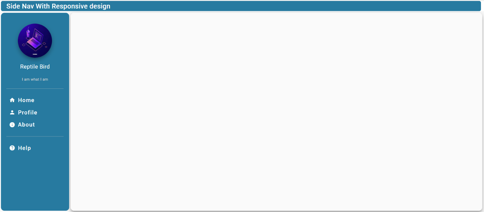
Creating a responsive sidebar design for a website involves creating a layout that adjusts its size and appearance based on the screen size of the device being used. This ensures that the sidebar is user-friendly on desktops, tablets, and mobile devices. Here are some key steps you can follow to design a responsive sidebar.

Prerequisites
- NPM (Node.js)
- Angular CLI
What Is NPM (Node Package Manager)
NPM (Node Package Manager) is the default package manager for Node.js, a popular runtime environment for building server-side applications with JavaScript. NPM is used to install, manage, and share packages of reusable code (known as modules) that can be easily integrated into your Node.js projects.
If you are new to angular, see how to install angular
Let’s see how much it is easier
Open your favourite command tool like CMD, PowerShell or GitBash, go to your preferred directory and execute the below commands.
ng new is a command provided by Angular CLI that is used to create a new Angular project. When you run ng new app-name, Angular CLI generates a new Angular project with all the necessary configuration files, folder structure, and boilerplate code to get you started with your application development.
Step To Create Responsive Nav Bar
1. Open a terminal or command prompt.
2. Run the following command
ng new app-name
Select routing and style as per requirement (enter y for routing confirmation)
cd app-name
ng add @angular/material --save
@angular/material is a library provided by the Angular team that enables developers to easily incorporate Material Design components and styles into their Angular applications. Material Design is a design language developed by Google, known for its clean, modern, and user-friendly aesthetic.
By using @angular/material, developers can leverage a wide range of pre-built components and themes that adhere to the Material Design guidelines. This helps in creating responsive, visually appealing, and consistent user interfaces in Angular applications.
Create Components For Responsive Nav Bar
ng g c is a shorthand command provided by Angular CLI for generating a new Angular component. When you run ng g c dashboard. Angular CLI creates a new Angular component with the specified name, along with necessary files and boilerplate code.
ng g c dashboard
ng g c home
ng g c profile
ng g c about
ng g c app-help
ng serve --open --port 9990
Now your application runs on localhost:9990.
Open your favourite editor, I am using Visual Studio Code.
Open app.component.html, remove all created code and paste the line below.
<router-outlet></router-outlet>
It acts as a placeholder that Angular dynamically fills based on the current router state.
Add Routes For Component Navigation
In Angular applications, the app-routing.module.ts file defines and configures the application’s routes. It is a separate module that helps organise and manage the routing configuration in an Angular project.
Go to app-routing.module.ts and modify as given
import { Routes } from '@angular/router';

//export const routes: Routes = [];
const routes: Routes = [

    {
        path: '',
        component: DashboardComponent,
        children: [
            {
                path: 'home',
                component: HomeComponent,
            },
            {
                path: 'profile',
                component: ProfileComponent
            },
            {
                path: 'about',
                component: AboutComponent
            },
            {
                path: 'help',
                component: AppHelpComponent
            },
        ]
    },
];
@NgModule({
    imports: [RouterModule.forRoot(routes)],
    exports: [RouterModule]
})
export class AppRoutingModule { }
In an Angular application, the app.module.ts file is the main module where you define and configure the application’s components, services, and other features. It is an essential file that bootstraps the Angular application by specifying the root component and setting up the dependencies.
Add the following line to the import section of app.module.ts
  BrowserModule,
  AppRoutingModule,
  BrowserAnimationsModule,
  MatToolbarModule,
  MatSidenavModule,
  MatButtonModule,
  MatIconModule,
  MatDividerModule,
Now It’s Time To Add A Menu To The SFor Nav Bar
Open dashboard.component.html
<mat-toolbar> Side nav with responsive design </mat-toolbar>
<mat-sidenav-container>
  <mat-sidenav mode="side" opened>
    <img class="avatar mat-elevation-z8" src="assets\images\123.jpg" />
    <h4 class="name">Reptile Bird</h4>
    <p class="designation">I am what I am</p>
    <mat-divider></mat-divider>
    <button mat-button class="menu-button" routerLink='/home'>
      <mat-icon>home</mat-icon>
      <span>Home</span>
    </button>
    <button mat-button class="menu-button" routerLink='/profile'>
      <mat-icon>person</mat-icon>
      <span>Profile</span>
    </button>
    <button mat-button class="menu-button" routerLink='/about'>
      <mat-icon>info</mat-icon>
      <span>About</span>
    </button>
    <mat-divider></mat-divider>
    <button mat-button class="menu-button" routerLink='/help'>
      <mat-icon>help</mat-icon>
      <span>Help</span>
    </button>
  </mat-sidenav>
  <mat-sidenav-content>
    <div class="content mat-elevation-z8">
      <router-outlet></router-outlet>
    </div>
  </mat-sidenav-content>
</mat-sidenav-container>
And add CSS as given below. ( CSS can also be defined globally but it is better to define CSS for each component separately).
mat-toolbar {
    background: #277aa0;
    color: white;
    height: 30px;
    margin-left: 5px;
    margin-right: 5px;
    width: 99%;
    border-radius: 5px;
}

mat-sidenav {
    margin: 5px;
    width: 200px;
    border-right: none;
    background: #277aa0;
    border-radius: 10px;
    padding: 16px;
    text-align: center;
}

.content {
    height: calc(93.5vh);
    border-radius: 10px;
    margin: 5px;
    margin-left: 10px;
    display: flex;
    justify-content: center;
    align-items: center;
    font-size: 2rem;
}

mat-sidenav-container {
    height: calc(100vh - 30px);
}

.menu-button {
    width: 100%;
    display: flex;
    align-items: center;
    justify-content: flex-start;
    font-size: 1rem;
    color: white;

    mat-icon {
        margin-right: 8px;
        color: white;
    }
}

.avatar {
    margin-top: 16px;
    width: 100px;
    height: 100px;
    border-radius: 50%;
}

.name {
    margin-top: 8px;
    font-weight: normal;
    color: white;
}

.designation {
    margin-top: 2px;
    font-size: 0.7rem;
    color: lightgrey;
}

mat-divider {
    margin-top: 16px;
    margin-bottom: 16px;
    background-color: rgba(255, 255, 255, 0.5);
}

span {
    color: white;
}
Now when we click on any button in the menu a new component will be opened in side-nav-content.
PS: We can toggle the side nav for full-screen utilization.
Happy Coding 🙂


Leave a Reply